Five forecast tools to help you make better decisions
05 October 2023

Understanding the likelihood of an extreme weather event can assist producers to plan, prepare and respond through better decision making on-farm.
As part of the MLA-supported Forewarned is Forearmed project, the Bureau of Meteorology has launched five seasonal climate forecasting tools to provide more insight into the possibility of extreme weather events:
- Chance of extremes maps for rainfall and temperature
- Chance of 3-day totals maps
- Decile bar charts for rainfall and temperature
- Timeline graphs for rainfall and temperature
- Probability of exceedance graphs for rainfall.
Here, we look into each tool and how producers can use them to plan operations past the seven-day weather forecast.
The chance of extremes maps show the predictions for unusually high and low rainfall or temperatures over one week, two weeks, one month or three months. These maps are an extension of the chance of above median maps.
The colouring in the maps indicates the chance or likelihood of experiencing extremes in rainfall or temperature as shown in Figure 1.
Figure 1: An example of the Climate Outlook Map forecasting unusually wet conditions issues during September 2022 for the two weeks between 10 – 23 September across eastern Australia. Reproduced from Agriculture Victoria’s eLearning course ‘Using seasonal climate prediction tools’.

The increasing intensity of colours used in the maps correlates to increasing chance of rainfall or temperature in extreme deciles. In a neutral forecast, the likelihood of any outcome is 20%. As such, the likelihood of an extreme dry or cold (decile 1 and 2) or extreme wet or hot (decile 9 and 10) is also 20%, and no distinct indication can be drawn from the forecast model results. Areas without data are represented in grey.
In the example in Figure 1, the map shows an above 80% chance of rainfall being in decile 9 and 10 of historical data for central Queensland. This means the likelihood of extremely wet conditions is four times higher than the chance of median rainfall typical for that time of year.
The chance of extremes map can show the likelihood of extreme cold events, however, it can’t indicate a frost. Minimum temperatures may give an indication of frost potential at certain times of the year, and this can be explored further using other Bureau tools and seven-day forecasts.
The chance of 3-day totals forecast maps show the chance of receiving ‘at least’ a given amount of rainfall total over three consecutive days. Forecasts are available for 15mm, 25mm, 50mm and 75mm of rain during a one-week or two-week period. Historic data (1960–2019) for chance of 3-day totals is available and accessible. Figure 2 shows a chance of 3-day totals map for the period 5 September to 11 September 2022.
Figure 2: Chance of 3-day totals for the period of 5 September - 11 September 2022.
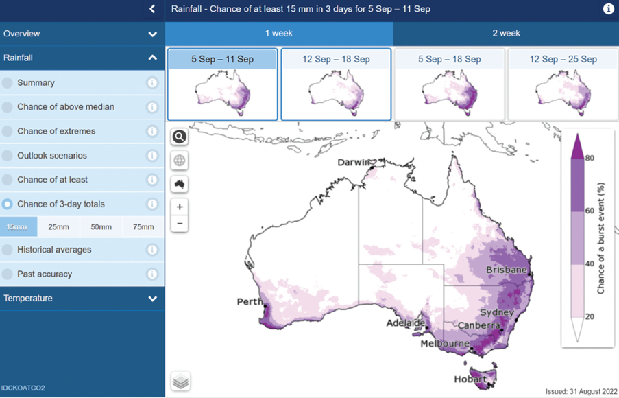
Note that the location-specific graphs in the chance of 3-day totals map do not present probabilities or deciles on a three-day timeframe. Instead, the location-specific graphs present data on the outlook for either one week or two weeks when selected in the chance of 3-day totals map, as with the chance of extremes map.
In this short video tutorial, Dr Tim Cowan from University of Southern Queensland demonstrates how to use these maps on-farm:
The location-specific decile bars* for rainfall and maximum and minimum temperature show the forecasted probability of a given range of rainfall or temperature outcomes. The chart can be accessed by selecting a location on the map or entering a location in the search function.
*Deciles break up a set of data into tenths.
Figure 3: Decile bars for the rainfall outlook at Clear Lake, Victoria, for February–April 2022. Reproduced from Agriculture Victoria’s eLearning course ‘Using seasonal climate prediction tools’.

The example forecast in Figure 3 shows that 38 from 99 forecast model runs fell into deciles 1 and 2 (unusually dry weather), which is nearly twice more likely than the likelihood of median rainfall for that time of year. However, note that the likelihood of the other ranges remains. For instance, there are still 11 out of 99 model runs that fell into deciles 9 and 10 (unusually wet weather) which means other outcomes (besides deciles 1 and 2) are still possible.
The tool’s infographic includes the historical median rainfall, which in this example is a historic median rainfall of 61mm for Clear Lake, Victoria, during February–April. In some locations the median rainfall can be 0mm at certain times of the year. In those instances, the range of likelihood of rainfall falling in a certain historic range for the given period is not that meaningful.
The star ratings beside the likelihoods indicate the past accuracy of the outlook. If the model has been reasonably successful at forecasting for this location and time during the past, it receives three out of three stars — a highly accurate result. Two out of three stars indicates medium past accuracy, and one out of three stars indicates low past accuracy.
Timeline graphs display a timeline of recent climatic observations from the previous weeks and months, against historic averages, to illustrate what might happen in the future.
The box and whisker plots show the variability of the 99 model runs for the four weeks or five months ahead. To make it easier, the shading of the graph aligns with the markers of the box and whisker plot to show the recent rainfall deciles (recent average rainfall indicated by the solid black line) and the predicted deciles (predicted medians indicated by the dotted black line) as illustrated in Figure 4.
Figure 4: Five-month timeline graph for predicted rainfall in Dubbo, NSW. Reproduced from Agriculture Victoria’s eLearning course 'Using seasonal climate prediction tools'.

The timeline graph can be accessed by selecting a location on the map or entering a location in the search function.
As with the decile bar charts, the timeline graph includes star ratings to indicate past accuracy for the outlook. The length of the whiskers and size of the box indicate the range of predictions. So, if most of the 99 model runs are within a tight range (compact box and shorter whiskers, e.g. July in Figure 4), it provides greater confidence in the prediction. However, as we’ve seen with the decile bar charts, any outcome is still possible.
The probability of exceedance is a graph with lines representing the forecasted and historical data of a certain location for a particular rainfall total as shown in Figure 5. The graph can be accessed by selecting a location on the map or entering a location in the search function.
Figure 5: Rainfall outlook for the month of October 2022 at Murray Bridge, SA. Reproduced from Agriculture Victoria’s eLearning course 'Using seasonal climate prediction tools'.

The red line in Figure 5 shows the likelihood of the chosen location receiving the median rainfall over the specified timeframe. In the example, Murray Bridge typically has a 60% chance of receiving 18.6mm rainfall, 40% chance of receiving 27.6mm and 20% chance of receiving 40.8mm during October. A drier time of year would typically show a steeper red line, whereas a wetter time of year would decrease the slope of the red line.
The blue line in Figure 5 represents the forecast. It shows how often the 99 model runs exceed a range of rainfall values. A blue line below the red line would indicate a drier outlook. A blue line above the red line, as shown in Figure 5, indicates a wetter outlook.
Tactical decisions ahead of extreme weather events
Long-term or strategic decision making can be the most cost-effective way to manage extreme events. Strategies to mitigate the risk of extreme weather include planting wind breaks and constructing shade structures for heat events, destocking early ahead of drought, or fencing off flood-prone areas.
Determining the costs and benefits of these decisions requires historical climate data and climate change projections on the frequency and severity of rare events, hence the importance of accessing resources such as the five Forewarned is Forearmed forecasting tools.
The tool descriptions above were sourced from the Forewarned is Forearmed and Department of Agriculture, Fisheries and Forestry’s publication Southern Australian Red Meat Industry Workbook: Making better tactical decisions using the climate forecast tools. For more information on tactical responses to extreme weather events such as floods, drought or heatwaves, turn to Chapter 3 (Tactical decision making in the southern Australian red meat industry) of the full workbook.